During my work in the energy industry I occasionally stumbled upon some nice graphics depicting trends and forecasts for the German and European energy market. I thus decided create some simple charts using Python and data available on energy-charts.info.
I decided to start with an analysis of the day ahead prices in Germany for the years 2015 to 2024:
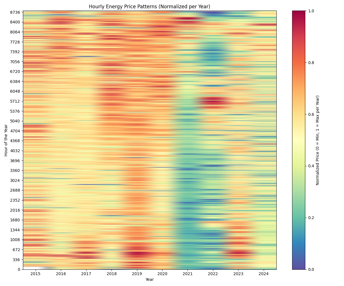
To achieve this, I clipped the top 1% of prices, grouped prices in percentiles (100 quantiles) and calculated the average price per percentile. This helps in accounting for extreme price spikes. Doing so allows us to compare price patterns over several years.
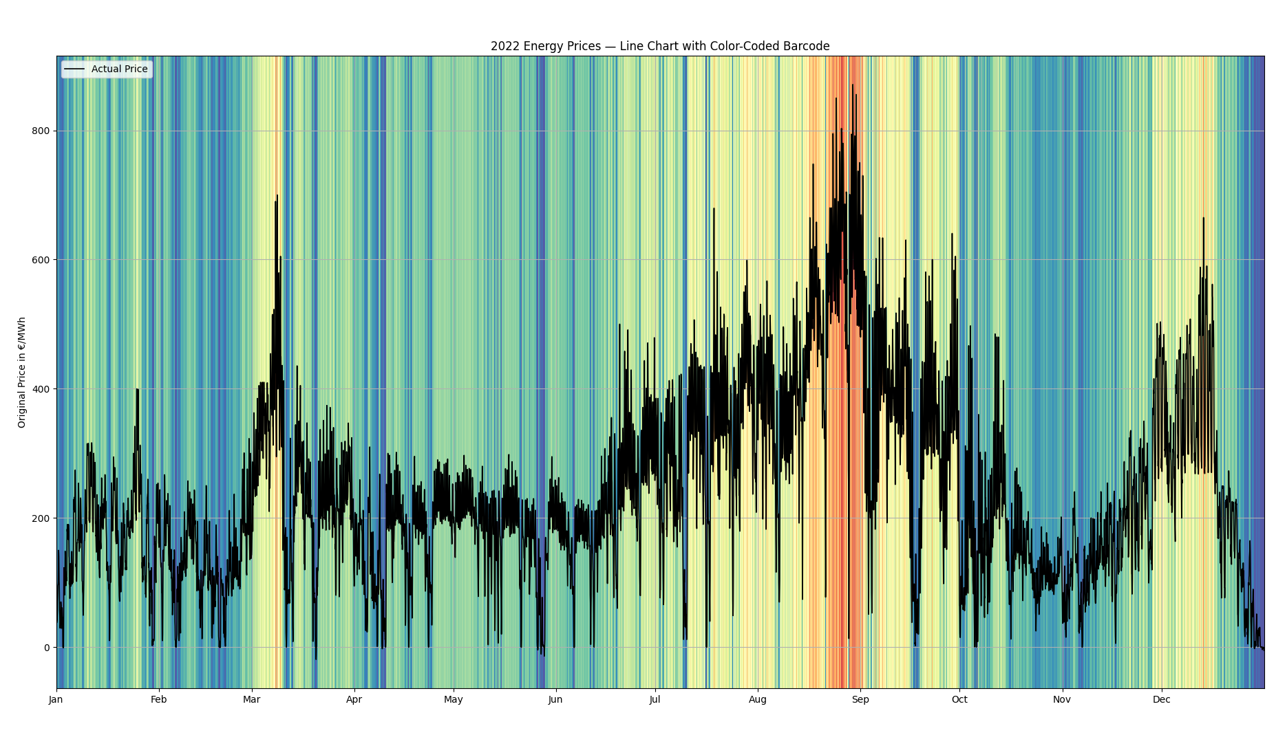
To clarify the meaning of this, I created an additional chart for the year 2022. The colouring is based on normalised capped prices, the line chart however depicts the original prices.
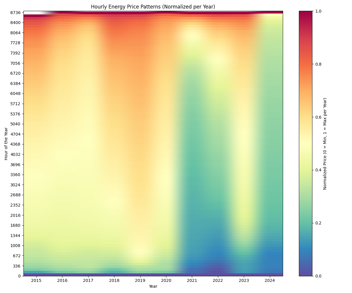
Another way of graphically analysing the data is by sorting the values. This allows us to graphically see, which share of the hours within a year is in a lower or higher price area:
It is visible, that some values in 2015 are missing (the white top left corner). Other than that one can see, that the share of blue and green values is rising over the years. This means, that lower prices are becoming more common, while the prices in the medium range are getting fewer. Since we normalised the values, however, this graph does not show the absolute values of the energy prices. The few relatively high prices could be rising in absolute terms, thus meaning that energy producers can make the same revenue in in less hours of the year. To make this a little bit more visible we identify the prices which correspond to a certain normalised price in a year, e.g. 0.1, 0.2 and so on.
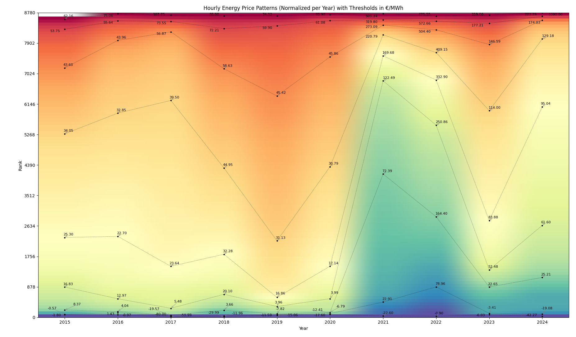
Doing so, we can observe a general tendency of growing prices. However, we also see that the absolute values of the very low and high prices have been rising a lot.
Schreibe einen Kommentar