Introduction: Electricity price forecasting plays a critical role in strategic planning and decision-making. In this post, I explore the use of the SARIMAX (Seasonal AutoRegressive Integrated Moving Average with eXogenous regressors) model to project electricity prices from 2025 to 2030. I leverage historical data from 2015 to 2024 and incorporating key external factors such as CO₂ prices, gas prices, load forecasts, and electricity generation from PV. This simple model captures both seasonal patterns and external influences to provide basic forward-looking insights.
Data and Preprocessing
For this model I used data from several public sources: Energy-charts.info (Fraunhofer Institute for Solar Energy Systems ISE), DWD (Deutscher Wetterdienst) and EEX. Additionally, I make several assumptions on the development of the price for Natural Gas, CO2, the installed capacity of solar energy (mainly PV) in Germany and the growth in electricity demand.
From Energy-Charts I used data from 2015 to 2024 on the load, the Day Ahead Auction Price for Electricity (DAA), the price for CO² Emission Allowances in the EU, the electricity production from PV and the installed PV capacity in Germany per Month. Additionally I used monthly data on the price of Natural Gas at the Virtual Trading Point in the Netherlands. From DWD I retrieved data on the global solar radiation for several stations in Germany.
| Title | Unit | Frequency | Source |
| Electricity load | MW | hourly | ISE |
| DAA price | €/MWh | hourly | ISE |
| CO²-price | €/t | hourly | ISE |
| PV output | MW | hourly | ISE |
| PV capacity | GW | monthly | ISE |
| Natural gas price | €/MWh | monthly | EEX |
| Global solar radiation | W/m² | hourly | DWD |
This data represents the historical data I use in my model. PV capacity and natural gas prices for the TTF were only available on a monthly basis, thus I unsampled the to an hourly resolution. This step is necessary because SARIMAX requires all exogenous variables to align exactly in time with the endogenous series (e.g. hourly electricity prices). This introduces the risk of oversimplification, since these flat values might not capture the short term fluctuations of the electricity price, especially the natural gas price.
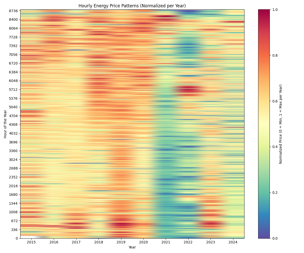
Preprocessing involved checking the data for missing values and resampling it to an hourly resolution covering the years 2015-2024. Using Pandas, timestamps and indices were standardised and aligned.
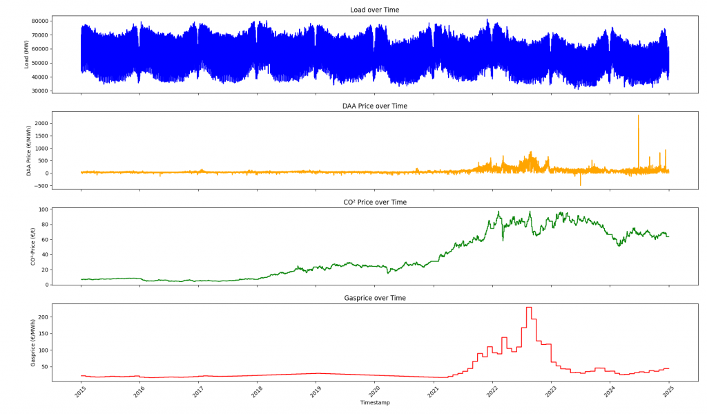
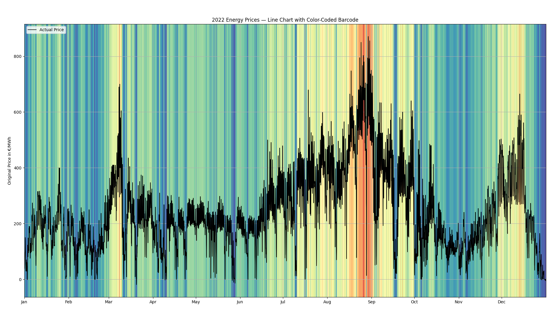
This first graph shows the electricity load as well as the prices for electricity, CO² and natural gas from 2015 to 2024 in Germany.
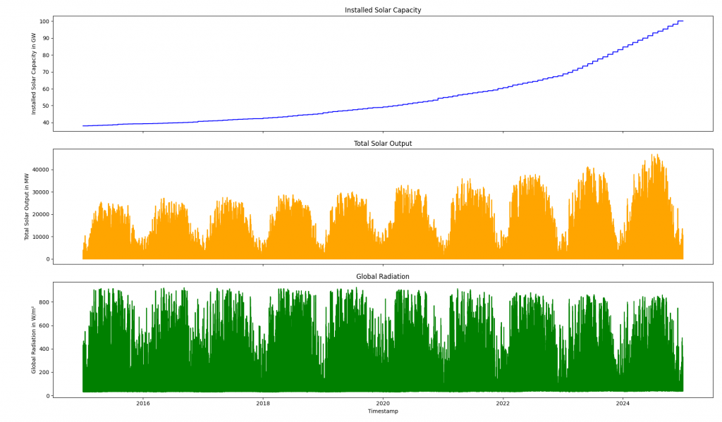
The second graph shows the installed solar capacity and the total solar output. Additionally, it shows the measured Global Radiation. It is visible, that with the rise of additional solar capacity, solar output rises. At the same time, the global radiation stays roughly the same, with some differences between the years.
Forecast Modeling with SARIMAX
In this project, I used SARIMAX forecast electricity prices in Germany for the period 2025 to 2030. As the training input I used the historical data from 2015-2024 as described above. I created time-based dummy variables for months, weekdays, and grouped hourly blocks as additional regressors to capture seasonal and temporal patterns.
As the basic resolution I set 8 hours. That means, that the model is resampling the historical data to averages of 8 hour blocks (0-7, 8-15, 16-23). When looking for weekly patterns, it thus looks at 21 data points per week. I choose this setup to save computational resources and time.
When it comes to exogenous variables in the forecast horizon, I chose 2016 as a reference year. That means, that I replicate the electricity load and the global radiation pattern of 2016 for the years 2025-2030. Regarding other variables, I decided to make assumptions on natural gas and CO²-Prices on an annual basis. Regarding the installed installed solar capacity, I assumed that the governmental goal of 215 GW in 2030 is reached and that growth is evenly distributed.
Replicating solar production from 2016 would not reflect growth of the installed capacity. The forecasted PV production is calculated using the following formula:
Pforecast(t) = Cforecast(t) / Chistoric(t‘) × Phistoric(t‘)
Variable definitions:
Pforecast(t): Forecasted PV production at time t
Cforecast(t): Forecasted installed PV capacity at time t
Phistoric(t‘): Historical PV production at corresponding time t‘ (2016)
Chistoric(t‘): Historical installed PV capacity at time t‘ (2016)
Regarding the electricity demand/load and the solar production we get two timelines for the forecasted time period. With an 8-hour resolution, the graphs look like this:
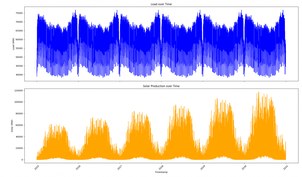
Related to the model, the resolution plays a very important role. In the plot above one can see, that solar production does not reach 0 anymore during summer times. This is due to the fact, that an 8- hour resolution (0-7, 8-15, and 16-23) does not reflect night time during summer properly, where there is no sufficient radiation for solar production. Since the model takes the average radiation of a block, this average radiation reflects in a solar production larger than zero.
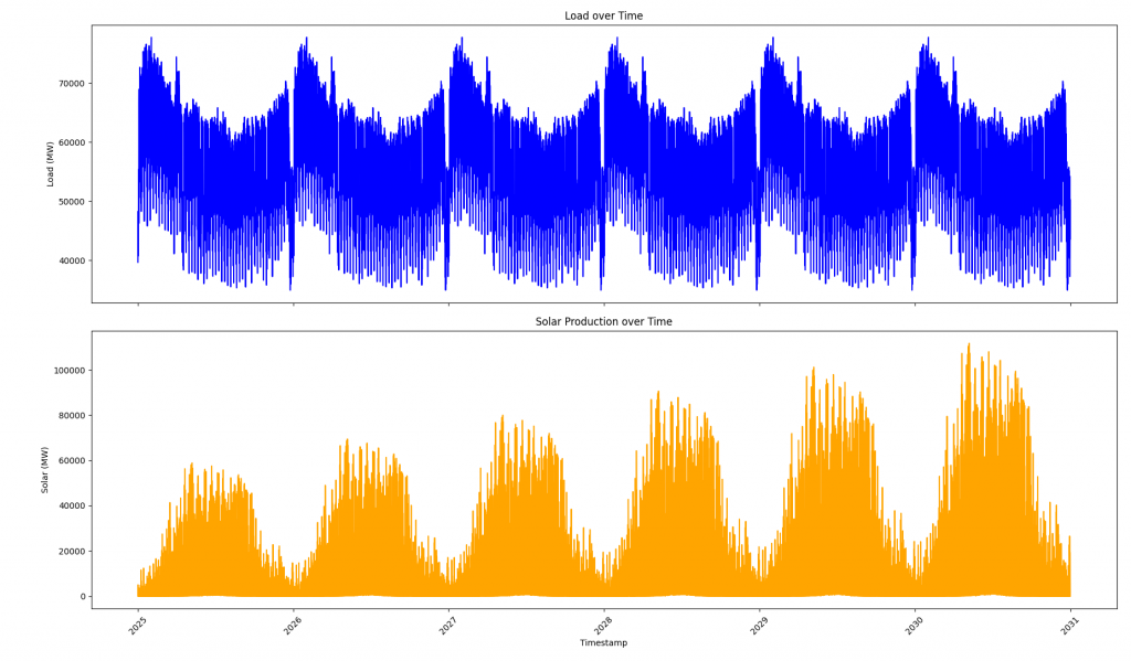
If we calculate the model with an 6-hour resolution, meaning 0-6, 7-12, 13-17, and 18-23), we are left with a better fit. I calculated this using only three years of historic data (2022-2024), to reduce computational time.
There are two parameters remaining, which I use as exogenous variables for the model, the price for CO² and natural gas. I assume, that natural gas stays on a price level of 45 € per MWh, while the cost for CO² emission allowances rises from 80€/t in 2025 to 130€/t in 2030.
| 2025 | 2030 | |
| Natural Gas | 45 | 45 |
| CO² Emission Allowances | 80 | 130 |
Forecasting and Scenario Design
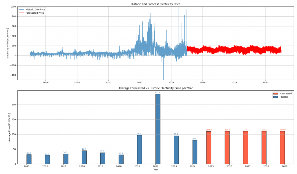
In the following sentences I want to talk about some parameters and their impact. The base scenario is defined as follows: 8-hour resolution, historic data from 2015-2024, reference year = 2016, stable gas price, stable price for CO² Emissions, and stable installed solar power capacity of 100 GW, no demand growth. With these parameters we get the following results:
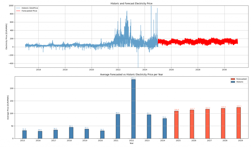
If we assume, again going out from our base scenario, that the CO²-price rises to 130€ in 2030, we get the following results.
If we assume, that the demand in 2030 is 20% higher than in 2025, the load is higher and we would expect higher electricity prices. This results in the following forecasted electricity price:

The parameter changes discussed above (rising CO₂ prices and increased electricity demand) can be considered relatively static in nature. They evolve slowly over time and do not exhibit high-frequency variation like weather or renewable feed-in. In the context of electricity price forecasting, incorporating such changes using a SARIMAX model essentially results in a vertical shift of the forecasted price curve. The overall shape and seasonal pattern of the curve remain largely determined by historical data.
This modeling approach has its advantages. First, it is simple and transparent. By adjusting only a few key parameters, such as the average CO₂ price, one can quickly explore different scenarios and assess their impact on the overall price level. This is useful for projections or policy comparisons, where the objective is to understand general trends rather than predict hourly fluctuations. Moreover, SARIMAX models are computationally efficient and can be implemented with relatively little data and effort.
However, this simplicity also comes with limitations. Static parameter adjustments do not capture interactions between variables. For example, a high CO₂ price may not only raise electricity prices but also change the merit order of power plants, affecting which technologies operate and when. Another example would be a significant change in the generation mix. This would result in a change of the shape and volatility of electricity prices. A SARIMAX model trained on historical data cannot anticipate these shifts, as it relies on the assumption that the past seasonal and cyclical patterns will continue into the future.
Modelling the Impact of Renewables: The example of Photovoltaic
In contrast, modeling the rise in installed solar capacity introduces a dynamic that significantly reshapes the structure of the forecasted electricity price curve. Assuming a growth to 215 GW of installed solar capacity by 2030 leads not just to a downward shift in average prices, but also to noticeable changes in the overall pattern of electricity prices throughout the year.
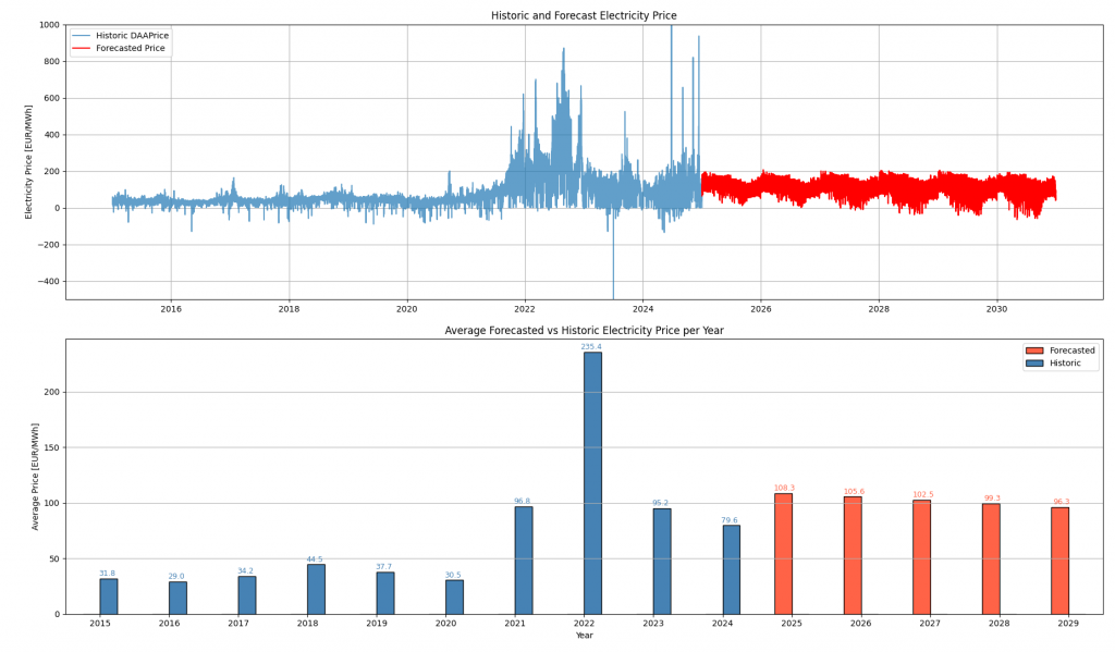
What stands out in the forecast is a clear downward trend in prices over time. This reflects the increasing contribution of solar energy to the electricity mix, especially during daytime hours when solar production is at its peak. As more solar power enters the system, the marginal cost of electricity drops more frequently. Consequently, the model shows a growing number of hours with negative electricity prices.
While the underlying model used here is deliberately simple, the qualitative results align well with expectations from energy economics. Of course, the results should not be over interpreted to reveal information on the exact prices or the amount of hours with negative prices. Since the model is trained with historic data, its patterns stem from a „world“ with 20, 50, or a 100 GW installed PV capacity, not 215 GW. More complex models would be required to quantify these effects precisely and to account for changes related to storage and grid constraints. Rather, the model only reflects the trend of a decrease in electricity prices and a rise of hours with negative prices, when installed PV capacity increases. The model’s ability to capture this trend, despite its simplicity, highlights the strong influence of solar expansion on price dynamics.